18/08/2009

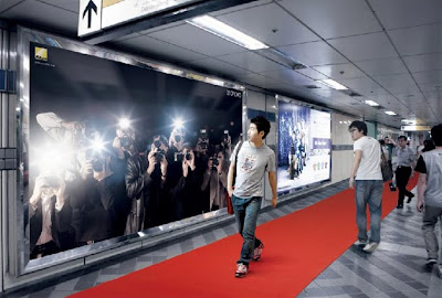
Nikon Launch Ad


An ad to launch the brand's D700 model in Korea. Inspired by our paparazzi culture, the ad is an interactive billboard where passersby act as the celebrities and trigger the flashing camera lights. The red carpets then leads them to a store where the camera can be purchased. Niffy.

Flicking Film


"Squeeze Me" by Kraak & Smaak
A great film/photo animation to a great catchy song. A great idea.

The Art of Brainstorming


My favourite part of the design process.

20/07/2009

I have TV


Some photogrpahs I took, trying to capture a threatening image of a tv in danger - near the water.
The colours have been altered, accidental at first but reviewing it now, I think it adds a dramatic alternative edge to the pictures.

Welcome Back


So i'm back to blogging after a little break. :D

17/04/2009

Graze


Three of your five a day, delievered in a box, to your desk by post.

Grazing is meant as an easy, healthy alternative to eating lunch. The price seems a bit steep personally and I reckon you could easily make them yourself and bring them with you to work... seems like a lazy option to me. But its nicely designed and set up and I can see why people would like it.

More info at www.graze.com

A Wolf Loves Pork


A really nice bit of stop motion animation using photographs.

Ghost Bikes

Came across this setup called Ghost Bikes (www.ghostbikes.org), where bikes are painted as a memorial for one who died whilst on a bike. These are then placed at the scene of the accident. Quite eary really as shown in the picture.


Reminds me of when DKNY painted a load of old bikes orange and locked them up around NY, the purpose trying to promote riding bicycles.

Alternate Crossings


Sweet


A nice ad I stubbled across. The concept, "communication just got sweeter" is clever in relation to the M&M product. Theres also potential for further ads, such as messages made out of the sweets too...how else could we communicate by using the sweet's letters?

A Positive Reminder


I like the alternative use of this advertising in the pool to remind it's audience of the serious message at hand.

21/02/2009

Walls does Pastry


Walls has launched a new range range of savoury pastries. Ziggurat Brands who previously rebranded the oringinal Walls sauages have designed this new range above.
It has a nice coordinated colourful stamp to it which sits nicely with the 'butcher brown paper' feel of the packaging, giving off a natural and heritage feel to the brand. I reckon it'll go down really well with consumers.

T-Mobile: "Life's For Sharing"


This is a brilliant viral advert created by Saatchi and Saatchi with 350 dancers dancing all over Liverpool Street station. We definitley need more of these stunt ads, they're a breath of fresh air to advertising.

24/11/2008

The Big Picture


A worthwhile photojournalism website. Has some really powerful images.

www.boston.com/bigpicture

23/11/2008

We Are One


by Michelle Simpson, University of Queensland

I like the overall concept behind this idea.
Acceptance, peace and unity were the keywords to this project, expressed through what people where, in this case Simpson chose jewelry.

The theory behind this drawing is that everyone has different tastes, beliefs, living situations, cultures and basically different ways of life, but they can all represent these differences in the same way. United on one hand, indicating peace between everyone from different boundaries around the world.

Dirty Hands?


Wash your hands with some rather neat but creepy hand-made hand soap.

29/09/2008

Smokin' Pictures


From October there will be picture warnings on packets of cigarettes to illustrate the health risks of smoking. Initiated by the department of health. The aim is to be more effective than the text warnings that is there currently.

The pictures portray the grim reality of what smoking really does to your body. However the pictures will be only on the back of the packaging, thus not being shown from the shelves, so maybe not having the a big a impact as needed. Most people already realize that smoking is bad for them, this then is just a hasher reminder.

The design of photographs are also a bit dull, comes across quite amateur and dated I feel, especially with the harsh blackness, and the red type. They obviously want to make a statement whilst being realistic, but I think even the photographs themselves could've been done to look a bit better.
28/09/2008

Spotting 'Geoffrey Todd Smith'


The Pearly Pits of the Peeled Poisonfruit, 2007 - ink and gouache on paper


Flick the Groom off Your Cake Topper and Turn up the Cyndi Lauper, 2007 ink and gouache on paper

His trippy hand-made drawings are inspired by activities of his youth—stickers, jigsaws and doodling. Great use of patterns and colours for your eyes to interact with.

Geoffrey comes from Chicago.

18/09/2008

The Frijj Shakes


Seriously worth checking out this website. Hilarious short films emphasizing the thickness of Frijj milkshakes. love them.

www.fourridgesmustbedestroyed.com/watch-the-films

David Callow


David Callow: Illustrator.
Particularly like his hands on approach, cutting out card/paper and assembling it. It help creates texture and depth to his delicate pen line illustrations. Nice.

15/09/2008

Plastic RIP


So I was having a think the other day about the whole, 'lets cut down on plastic bags' movement to help save the planet. -which i totally agree with- However I was mulling over the other uses we have with these plastic bags, for example what would we line our small bins with? what would we put our dirty smelly trainers in? what would we pick up dog poo with? and so on.
Surely this is a problem and a gap for a few nifty inventions; or perhaps just time for some personal environmental changes.

Take Me Home


http://thetoysociety.blogspot.com
They make toys and drop them off all over for people to pick up and take home, all they ask is that you report it found via their blog. A sweet idea to create stories from.

12/09/2008

Time for Tea


You'll either love 'em or hate 'em. Some great British handmade teapot designs, to get us in touch with our roots.

Days With My Father


www.dayswithmyfather.com
Spotted this website in a magazine, its a photo journal about Phillip Toledano's relationship with his father. After viewing it I was a bit unsure as to the purpose of the site, is it for his father?(who has no short term memory), for strangers like you and I? or for himself? Either-way its a very emotional and compelling insight, with heartwarming photographs which speak for themselves, accompanied by quirky bits of texts. A simple, beautiful, elegant piece.

The choice of navigation on the site is also worth checking out, slightly different from the norm.

11/09/2008

A Glass Half Full?

Theres been a lot of debate surrounding the relaunch of the Cadbury adverts which were created by Fallon. Basically they have changed the songs to them, and many view this as lazy as the footage is the same and dosn't link up perfectly to the actions.
(If you play the 2 clips below at the same time, you can see how similar they are, one is basically longer than the other and thats it.)

The original advert with the Phil Collin's "In the air tonight" song...


The more recent version of the advert with Bonnie Tyler's "Total Eclipse of the Heart"...


Personally I prefer the Bonnie Tyler version as I find the song much more dramatic and audibly powerful, however it's a shame they didn't manage to make the ad slightly more different to the first one, to create more of an impact.
Which one do you prefer?

DIY Google


Twas searching through some blogs and saw this fab idea.

a BIG ad


A big powerful beer ad for Carlton Draught.

08/09/2008

The Metal Collector


David Buckingham
Works and lives in LA.
Collects metal from around Southern California and welds them into fantastic pieces of sculpture. I love them. He doesn't paint any of it, the colours are the original colours of the collected metal.

Nate Williams


Nate Williams, aka Alexander Blue, an artist, illustrator and designer.
You can gather his South American background within the style of his illustrations. I like his lettering/typographic style, an alternative hand drawn style, with a quirky edge.

07/09/2008

Weight Ads

With reference to my previous post on advertising for diets, i've managed to collect a few weight related ads. From looking around a bit, I have to say there aren't many about, perhaps this is down to its sensitive topic? But isn't it about time it was addressed properly?