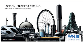
Below is an example of one of his commercial projects.

Client: TFL
Agency: M&C Saatchi
I particulary like how obvious the picture is...its obviously London with the key landmarks such as the london eye; and its also obviously bicycle parts too. The idea has come together well making again an obvious statement which links to the conclusive copy at the top. This kind of ad may not be immediatley eye catching but I think its quite witty in the way its made and for that people will absorb it's message.
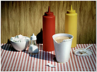
Kitchen also produced some more casual photographic work, below is an example which I find inspirational from his personal collection.

The above photo has a sense of realistic charm, but posed at the same time; 'strikingly ordinary' one may say.

4 comments:
i really like the london made for cycling, you have to do a double take, one moment you see all the bike parts, the next you see the london landscape, very clever. The copy is just a small link to reinforce the visual stimuli.
Agree with holly on this one.
But as Liz said its the simplicity of it that makes it work so well. One creative director said to me an advert should be able to explain itself as two different elements, copy and image. Both should work individually but combine to create a strong meaning. I think this works on that level.
I like designs that make you double take, like this TFL one does. It is very clever. However, I do think that it is quite cluttered. Maybe it could have been more simplistic.
It also reminds me of some of the other ideas people had for the London 2012 Olympics logo where people tried to incorporate symbols of London into the logo. Kitchen has done a similar thing here with the objects related to cycling.
London Made For Cycling - Clever link between the two in order to visually communicate the message/link and as Anthony said, both copy and image work as different elements and together. It would have been quite an original piece had there not been an influx of proposal for the Olympic Logo...but perhaps within this idea there is some potential for a campaign relating the Olympic sports with the city in the run up to the game?
Post a Comment