25/07/2007
Beans For Thought
Client: Jelly Belly
Copywriter: Geoff Skigen
Art Director: David Swope
Photographer: Larry Kunkel
www.swopecreative.com
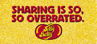
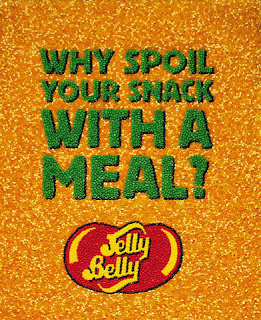
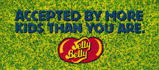
Above shows a series of eyecatching billboards which consist of tons of jelly beans glued together (manually by hand) to create these copy based ads. Each has a humorous catchy slogan which is attention grabbing -however also slightly controversial in the sense for example, "sharing is so overrated" implies being selfish is good, or that eating jelly bellys is better than eating a healthy meal.
Yet the tone of these ads suggest they are trying to be slighlty comical anf fun (targeting thier audience too), meaning the copy itself isnt the message which the ads are projecting - instead its eat more jelly bellys because its fun, exciting, and most of all tasty.
I think the main attraction for me from these ads is the way in which they have been produced; made from the product itself, this lends itself detail through texture and depth to the ads...which I think overall makes all the difference.
15/07/2007
MTV2 Brand Identity
Client: MTV2
Designer: Stacy Drummond
Art Director: Jim Debarros
Creative Director: Jeffrey Keyton
Producer: Leslie Legare
This identity caught my eye the other day, its of a particular style which seems to appeals to me.
The MTV2 identity has been designed with its audience in mind - young males, fans of rock and hiphop.
They made a radical decision to break away from the MTV logo and rebrand the network completely in order to suit their audience better.
The idea behind it... the dog is a man's best friend, adding a freaky/outrageous twist with the double heads (ties in with it being the "2nd" channel too)...ment to reflect the untamed nature of the MTV2 channel.
Unexpected, sometimes shocking, unpredictable and unruly define the new MTV2.
MY VIEW: Theres a level of wit and sophistication evidence in this identity which communicates well with its target audience. Its simplicity style (single colour and outlined shape) adds to its impact, and the type in the centre is clear an obvious- instantly telling you who they are.
10/07/2007
Business Card
Whilst looking at business cards the other day I came across this particular design for a divorce lawyer's card. I thought it was a great idea how you could tear it in two- as you could imagine people in an argument would - and still have the contact details on both halves. The design couldn't be better suited for the job.
Subscribe to:
Posts (Atom)