25/09/2007
Change your nose cup
Came across this niffy piece of product design, quite funky i thought. Seen something like this before so is prehaps getting a little bit common and therefore the effect is less striking, this calls for news ideas!
Play-Doh Perfume
16/09/2007
A City With No Ads
An advertisment for Sky Movies about taking away ads....kind of controversial? But it shows the blank spaces where ads would be, and makes those spaces seem almost beautiful.
09/09/2007
Cambrian Organics
Cambrian organics -
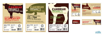
Some branding and packaging designed by 'Stillsdesign' for a group of welsh farms who produce premium organic meat to sell to the major supermarkets such as Tescos and Waitrose. The design idea is to reinforce the unique quality of the enterprise and its organic credentials. It's minimal packaging utilising as little materials as possible.
The ways its been illustrated is appealing with a rough organic edge (through colours used) to it with the heavy type and bold imagery. It also comes across as quite trendy and would definitly grab my attention among the 'meat' aisle in the supermarket.
25/08/2007
An Old Michelin Ad
The message here, of course, is "if you don't lay out the extra cash for Michelin tires, you are going to kill your own child." A strong message which gets translated across through the imagery shown. The designers here have opted for a shock approach, trying to hit their consumers with a dose of reality which really works.
24/08/2007
Marmite Ad
Advertiser: UNILEVER BESTFOODS
Product or Service: MARMITE SQUEEZY SPREAD
Entrant Company: DDB LONDON
Country: UNITED KINGDOM
Advertising Agency: DDB LONDON
Country: UNITED KINGDOM
Creative Director: Jeremy Craigen
Copywriter: Theirry Albert
Art Director: Damien Bellon
Photographer: Andy Rudak
Illustrator: Dermot Flynn @ Dutch Uncle
Account Supervisor: Tamsin Northridge/Jonathan Trimble
The series of ads shown above are great. They play on the marmites tagline of 'you love it or you hate it' well. Picking particular people or topics which are also a 'love them or hate them' character. This kind of advertising really appeals to me as they are using the product's key identity and adapting it to create a really clever ad, with a link thats clearly obvious.
16/08/2007
Art For London Underground
Whilst on the topic of the "London Underground" I thought i'd post the famous advertising poster "The Tate Gallery by The Tube" by David Booth, 1987. (Agency: The Fine White Line)
The brief set for this work by 'London Underground' was to simply create something decorative to cover up the empty advertising spaces on the underground.
I like how they've created an advert for the gallery, which is designed by 'the tube' - which links in cleverly with the paint tube displayed and london underground tubes. The actual work is a photograph of real paint laid out in the style of the underground map using the correct colours for realism. Its very simple and I reckon the copy completes the the design, giving it that witty edge which makes people remember it. And remember it they did, hence it was nominated as one of the ten best posters in the world!
Labels:
Advertising,
Designer,
poster
David Shrigley
I came across a last years free fold out tube map of the london underground the other day, noticing it was nicely illustrated by David Shrigley. The illustration follows the original design produced by Harry Beck, taking a comical or some may say an opposite perspective, displaying a present-day response to the rational certainties implied by Beck.
The design of the london underground tube map implies - "getting from A to B is a simple matter."
However as many personally know nowadays travelling via tube is not so simple, and the Shrigley's chaos probably portrays a picture closer to the truth.
When looking through his website I managed to find a small collection of work which personally appealed to me. I particulary like his style of simplistic monotone rough-edged illustrations.
The one above made me chuckle. Its so uncomplicated, almost effortless, yet witty at the same time. This particulary reminded me of the cards and products made by Edward Monkton, whos illustrations I also enjoy very much.
His illustrations certainly prove that colour and details aren't always a necessity to successful work.
Shrigley also takes photographs which can be easily viewed on his website, one which caught my eye labelled 'Giraffe', is shown below...
Labels:
Designer,
Illustration,
Photography
05/08/2007
Halls 'Defense' Sweet
The general idea behind these outcomes is good, it clear that the illustrations fit in well with the copy "Protect Yourself", highlighting the fact that the cough sweets will protect you against illness. Even the idea behingd the illustrations is good - with the sweet steping into another defense/protect situation. I particulary like the the rollar blade one, maybe because the sweets' squareness suitably fits in. Hower one critism I would say is that maybe the style of the illustrations could be stronger, in an alternative way, something to give the idea a greater impact which it deserves.
Morrison's Revamp
Has anyone noticed the new Morrison's logo?
Apparently Morrison's is undergoing a revamp alongside getting a new chairman. So they've decided to declutter their stores (getting rid of all those market stalls), change their slogan from "More reason's to shop at Morrison's...." to "Fresh for you every day"/"Fresh choice for you" (bit confused which one is the slogan and which is for the ad campaign, anyone know?)
...They've taken away the only thing people really associate with Morrison's which is that slogan.
The actual logo on the other hand WAS awlful with the stark yellow and black M, but now with the change, its STILL alwful. Few commented it looks like the Somerfield logo a bit and I have to say that I agree. The money spent on such a drastic change in my opinion was not well spent! What do you think??
04/08/2007
Nicholas Manion
www.nickolya.net
Nicholas Manion is a student at the Queensland College of Art, Brisbane. The work above is part of his collection "Works In Paper", which demonstrates aims "...to transform a commonplace material and create something extroadinary...".
The image shows sillohettes of cities made out of differnt currency notes.
On his website he comments... "Money circles the globe forming links between cities on opposite sides of the world. I must give them a voice and share the stories they tell..."
This line of copy is great! It has a powerful edge to it, maybe if there was a bigger link with this copy to the artwork the purpose of the work would be better defined??
Personally I wouldn't go as far as saying Manion has created something "extroadinary", but nevertheless he has discovered an interesting link between different currency and how it travels from country to country. Using a creative hand to display city outlines on different notes; I feel however something more could've been done to give it that finishing touch, what that is though i'm not sure.
Craig Ward
www.wordsarepictures.co.uk
Ward is a typographic designer and illustrator based in the Uk.
The three images above are a varied collection from his online porfolio "words are pictures", they reveal the wide range of his work.
The first called "Alphabet City// oo2 London" A typographic interpretation of London, on inspection you can notice how the arrangement of words spell out symbolic places which create the city. The vibrant use of colours and the varied sizes of the type shows creativity and adds interest to the work.
The second is a typeface called "Talking Heads". I picked this out because it amused me on first impression. The faces almost talk to one another but blend in well with the letters, creating a whole and not two parts as a letter and a face. The usability of this typeface is probably questionable, however it's evident that the pure design effect it has upon sight is worth it.
Thirdly, some protional artwork for six degrees album. This one takes a different approach to typography, using a hands on style with the rearrangemenrt of mathematical protractors. It works well with the name and is just about legible, giving the onlooker a slight challenge to discover the copys' content; however it's instantly recognisable once seen once.
Labels:
Designer,
Illustration,
Typography
03/08/2007
Bookshelf
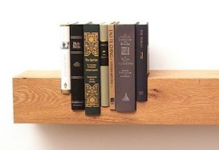
On the same website as below I discovered this splendid bookshelf design, which I thought looked great, very unique, obviously it comes with its problems - have to keep the same books there.
It has been designed by Mike and Maaike, the main idea is to create all the books at the same height, hence saying each book is just as important as the other, no one book reigns the shelf.
There are also more bookshelves produced by other designers including one made with a pogo stick and one that makes the books appear as if they are floating. Some great product design.
Judging Books By Their Covers
We all know we do it. Pick up a book because of its attractive, appealing cover. Assuming the contents will mirror the style of its outer self. But how often are we satifised?
Check out this nice book cover site
You can click on the covers which then leads to more details about the book's design. A great site if you were looking for book covers inspiration.
01/08/2007
Disabled Banner
This is an internet banner produced by Mcaan Erickson (Brazil)
Can be found by clicking: Banner
Discovered this internet banner the other day, it objective is to show the difficulties disabled people have, in this case focusing on people in wheelchairs. The banner has been cleverly produced with a horizontal scroll bar, which makes a man in a wheelchair move across a pedestrian crossing, just over halfway it gets stuck trying to get over the curb. A message then comes up highlighting the charity it supports.
However would people actually be tempted to scroll along or would it be ignored? There also needs to be a call to action at the end like a phone number which people could donate too maybe to add more of a purpose to the banners' existence.
Overall though I think its a clever idea, taking a different perspective to get a cross an important message!
25/07/2007
Beans For Thought
Client: Jelly Belly
Copywriter: Geoff Skigen
Art Director: David Swope
Photographer: Larry Kunkel
www.swopecreative.com
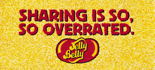
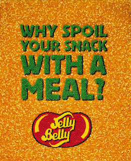
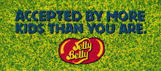
Above shows a series of eyecatching billboards which consist of tons of jelly beans glued together (manually by hand) to create these copy based ads. Each has a humorous catchy slogan which is attention grabbing -however also slightly controversial in the sense for example, "sharing is so overrated" implies being selfish is good, or that eating jelly bellys is better than eating a healthy meal.
Yet the tone of these ads suggest they are trying to be slighlty comical anf fun (targeting thier audience too), meaning the copy itself isnt the message which the ads are projecting - instead its eat more jelly bellys because its fun, exciting, and most of all tasty.
I think the main attraction for me from these ads is the way in which they have been produced; made from the product itself, this lends itself detail through texture and depth to the ads...which I think overall makes all the difference.
15/07/2007
MTV2 Brand Identity
Client: MTV2
Designer: Stacy Drummond
Art Director: Jim Debarros
Creative Director: Jeffrey Keyton
Producer: Leslie Legare
This identity caught my eye the other day, its of a particular style which seems to appeals to me.
The MTV2 identity has been designed with its audience in mind - young males, fans of rock and hiphop.
They made a radical decision to break away from the MTV logo and rebrand the network completely in order to suit their audience better.
The idea behind it... the dog is a man's best friend, adding a freaky/outrageous twist with the double heads (ties in with it being the "2nd" channel too)...ment to reflect the untamed nature of the MTV2 channel.
Unexpected, sometimes shocking, unpredictable and unruly define the new MTV2.
MY VIEW: Theres a level of wit and sophistication evidence in this identity which communicates well with its target audience. Its simplicity style (single colour and outlined shape) adds to its impact, and the type in the centre is clear an obvious- instantly telling you who they are.
10/07/2007
Business Card
Whilst looking at business cards the other day I came across this particular design for a divorce lawyer's card. I thought it was a great idea how you could tear it in two- as you could imagine people in an argument would - and still have the contact details on both halves. The design couldn't be better suited for the job.
18/06/2007
Jonathan Kitchen
Jonathan Kitchen - Photographer
Below is an example of one of his commercial projects.
Client: TFL
Agency: M&C Saatchi
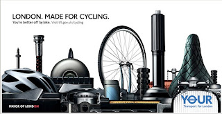
I particulary like how obvious the picture is...its obviously London with the key landmarks such as the london eye; and its also obviously bicycle parts too. The idea has come together well making again an obvious statement which links to the conclusive copy at the top. This kind of ad may not be immediatley eye catching but I think its quite witty in the way its made and for that people will absorb it's message.
Kitchen also produced some more casual photographic work, below is an example which I find inspirational from his personal collection.
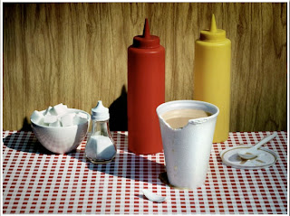
The above photo has a sense of realistic charm, but posed at the same time; 'strikingly ordinary' one may say.
Labels:
Advertising,
Designer,
Photography
A Personal Favourite
I was trying to think of one of my favourite TV adverts, and one that instantly sprung to mind is the AA "You've got a friend" ad.
It has a powerful, lasting impact on the viewers, creating a personal effect on the audiece as if the AA man is singing directly to them. The use of the song itself works extremely well too especially as it builds up momentum as it goes along creating an uplifting feeling within the viewers, presenting the AA workers as almost heroic!
The music lyrics produce a key base in relation to the storyline of the advert.
The way they've involved a whole team of AA workers(in yellow coats) symbolises their work ethics well, and the use of one main guy (Black Guy) to start and finish the singing gives it some unity.
The ad is very memorable which I reckon is down mainly to the catchy song; overall a very well developed/constructed TV ad which people don't mind watching again and again.
I also managed to find an older AA tv ad from 1977, it also uses catchy music as a key theme in its production. They're both emotional touching, dont you think?
29/05/2007
Simple Advertising
This is a billboard for World Wildlife Fund created by DraftFCB Toronto. Its a very simple idea which is extremley effective. It uses the sun to create a shadow on the billboad which act as the water levels in the ocean. Like it!
Labels:
Advertising,
Ambient Media,
video
Get The Message
www.getthemessage.net
Here is a new message sending tool created by Glue London as part of a Royal Navy Campaign which aims to demonstrate that careers in the Navy are far more exciting than those in civilian life.
The site is quite entertaining, and through real life videos makes you realise the seriousness of their jobs. However maybe this feature is a bit pointless in function...for exampl how exactly would people hear about it in order to use it??
Glue London also produced a series of interactive web ads, you can check them out on their website. They're pretty good, being interactive, dramatic, and clearly getting across their message that life in the navy is not all that you think it is.
26/05/2007
Excitingly Boring
These posters were created by Matt Burvill for Graffik and Channel 4 Ideas Factory. The concept was to explore the word 'creativity', so he uses a boring item, such as the chair...to create something artistically exciting. I reckon its a good idea, especially how the shapes are actually cut out of the chair, you could do the same with other objects like....curtains or washing...
Illustration
Some illustrations by Bob London which I spotted.
Particulary like how he portrays his people, they look almost sinister. His use of limited colour works well too, with the thin black biro-like lines of the images.
25/05/2007
B.I.O
B.I.O or "Bendable Interior Objects" by Form Us With Love www.formuswithlove.se
These were a design concept developed by 'Form Us With love' who are a design studio set up in Sweden in 2005.
Its interesting to think you could almost make anything out of paper/card; its very much like origami, which a lot of their work seem to stems from.
Visually it may not be very attractive - a bit too structual/industrial maybe - but it would most likely catch your eye if you turned up to a hotel reception and all the furniture was made like this don't you think...
23/05/2007
Selling An Experience
Came across this website for playstation the other day, thought it was quite good as to how it sells an event.
www.playstationexperience.co.uk
The website itself is quite simple, but it works well with the animated/illustrated effects used; these also help withold visitor's attention, making them browze other areas of the site, intrigue to what the characters will do next etc.
www.playstationexperience.co.uk
The website itself is quite simple, but it works well with the animated/illustrated effects used; these also help withold visitor's attention, making them browze other areas of the site, intrigue to what the characters will do next etc.
Subscribe to:
Posts (Atom)